Prostor
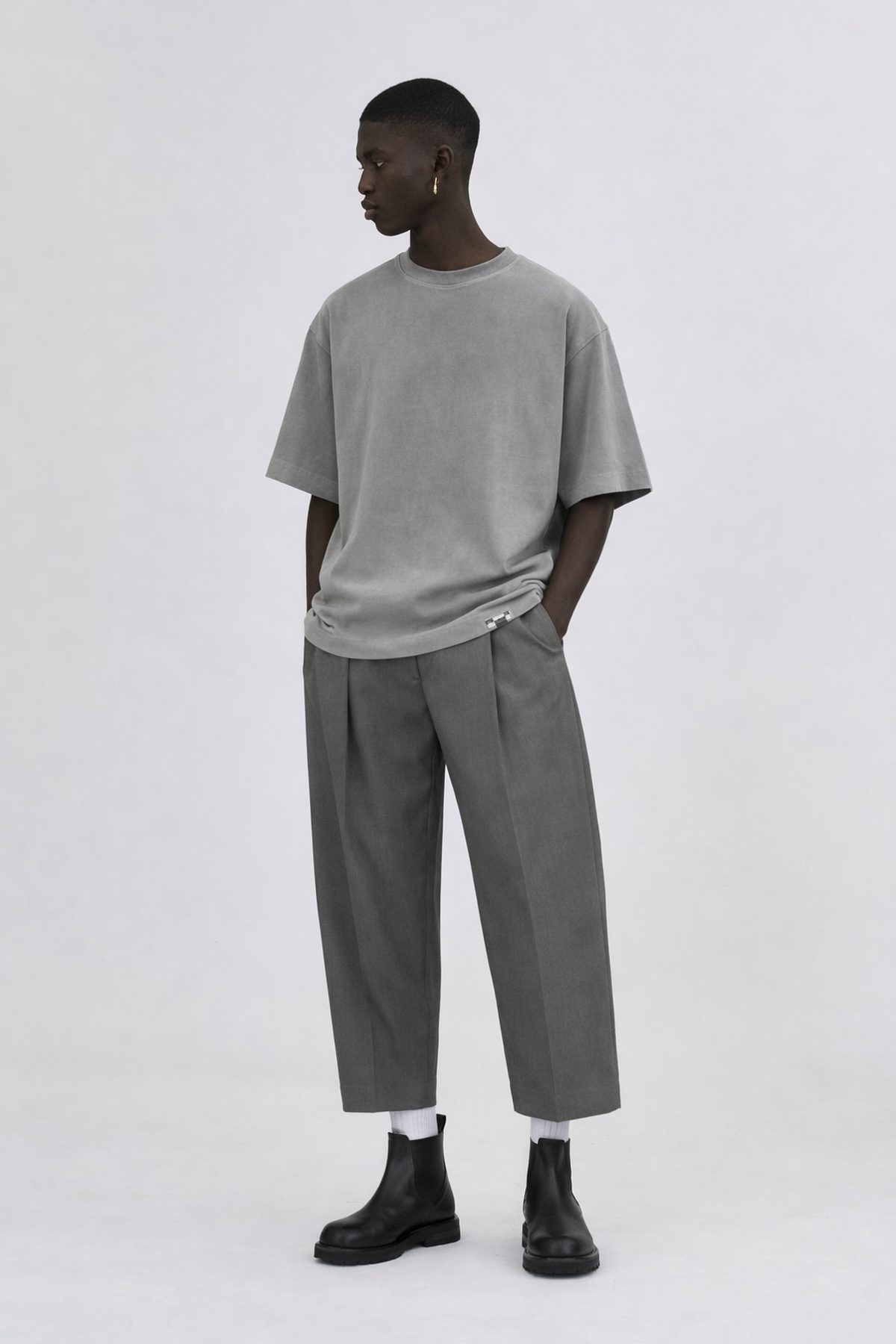
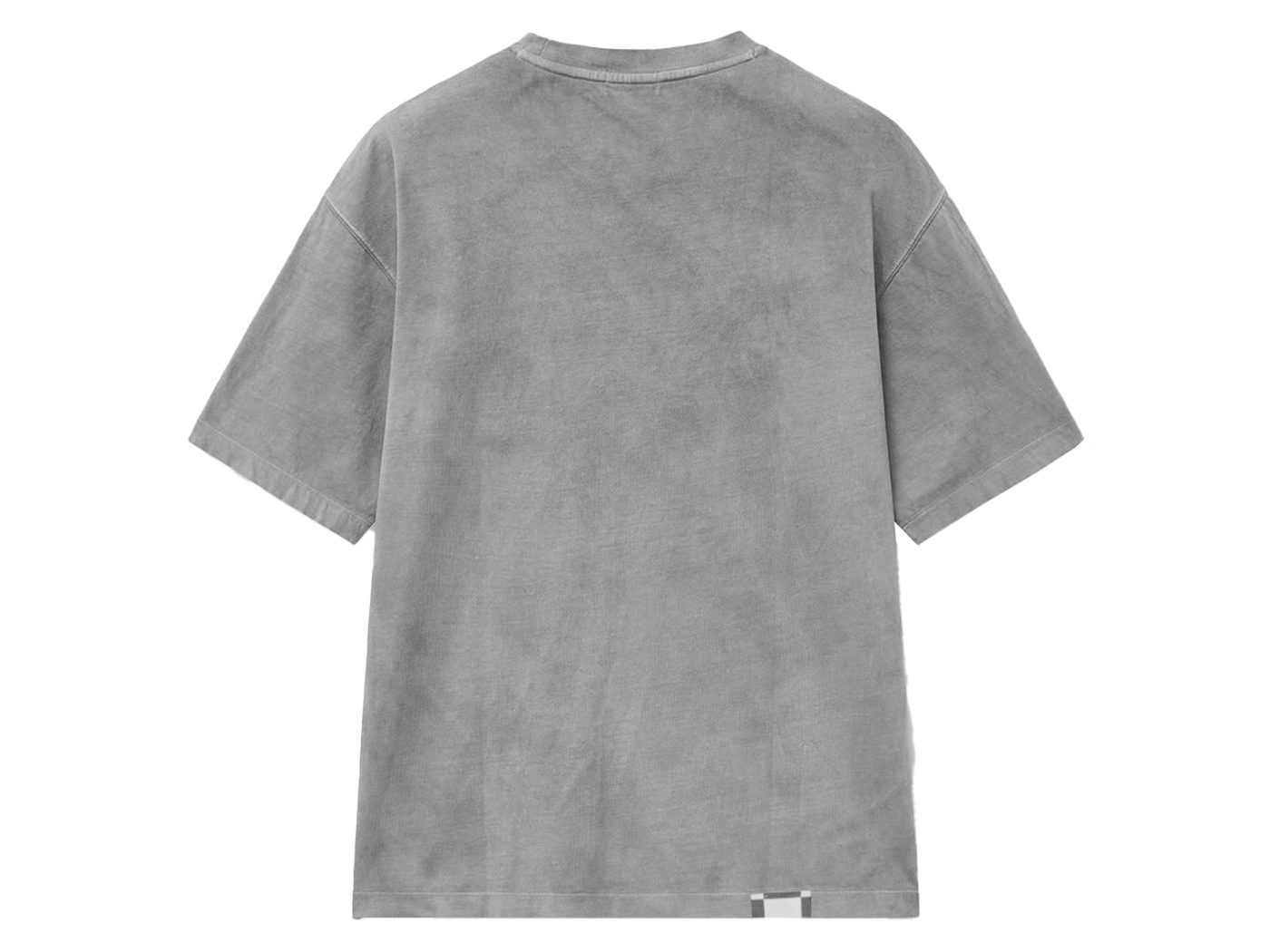
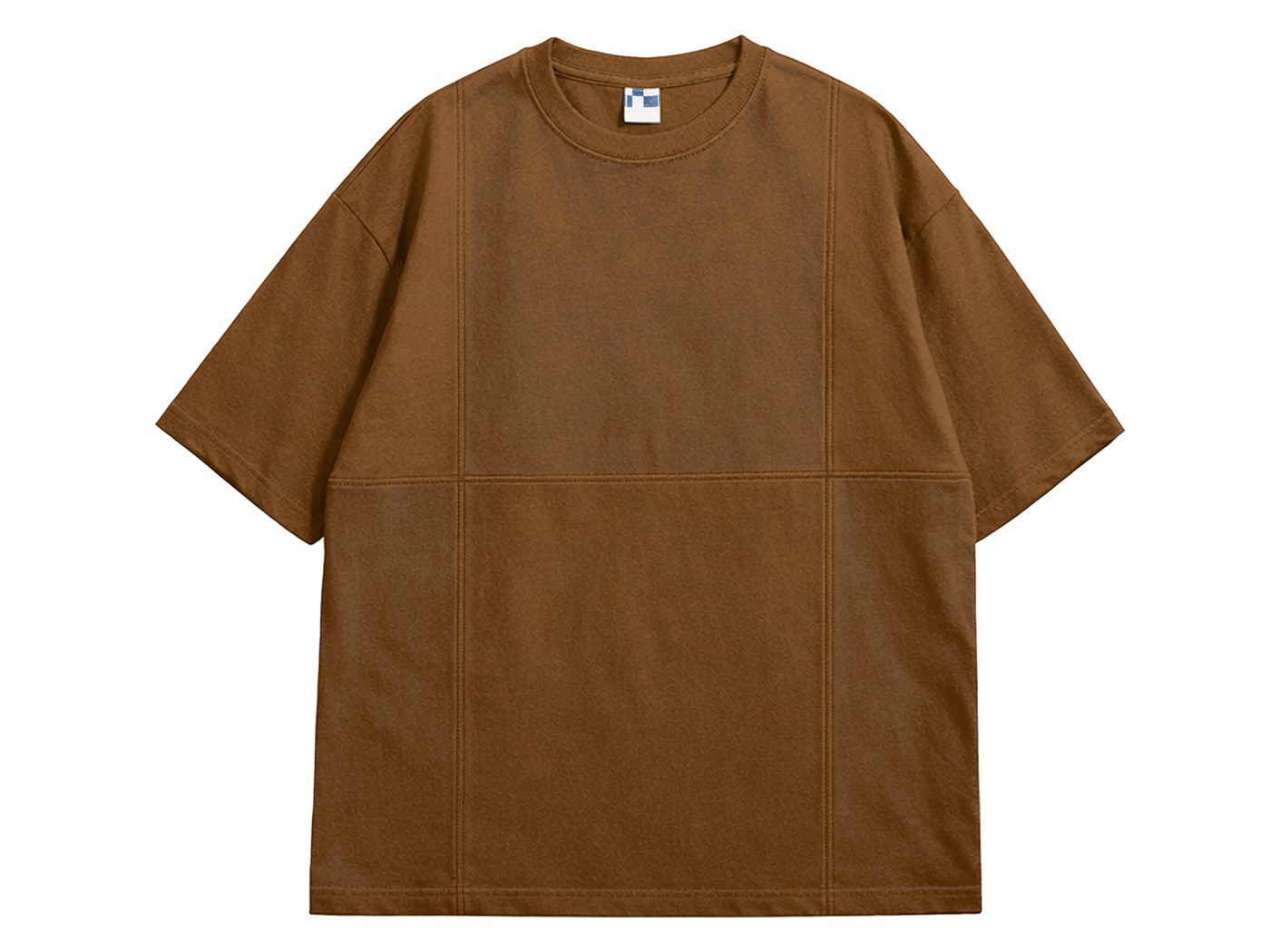
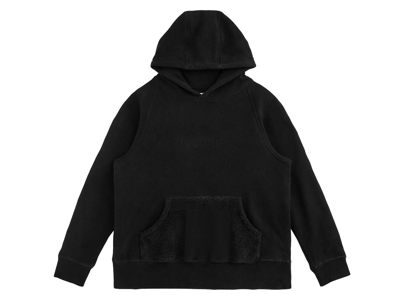
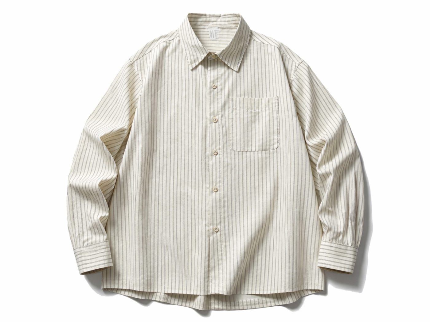
Prostor is a clothing brand built around loose-cut, functional pieces—clothing that carries a sense of freedom and space rather than just following the body's own lines. The name itself means openness, expansiveness: room to move.
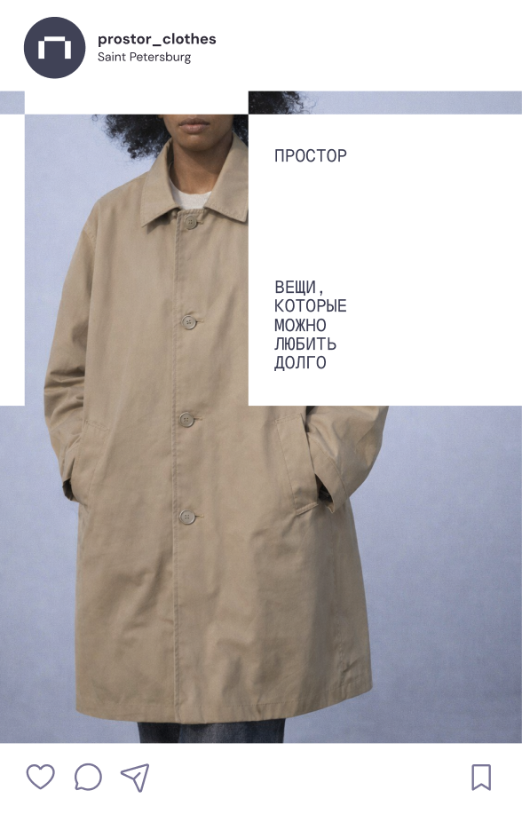
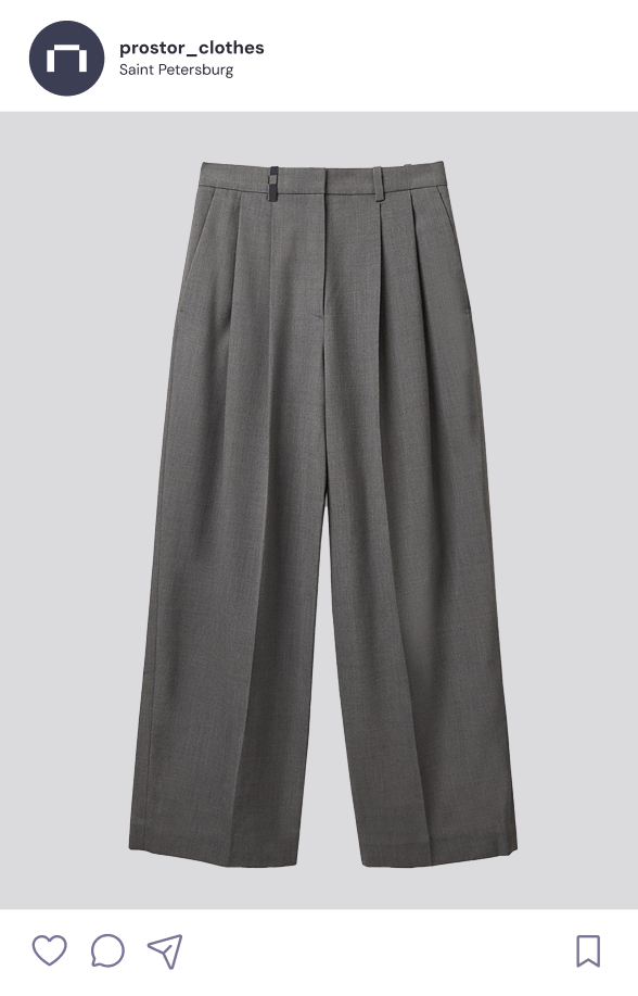
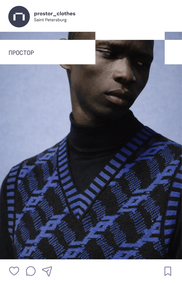
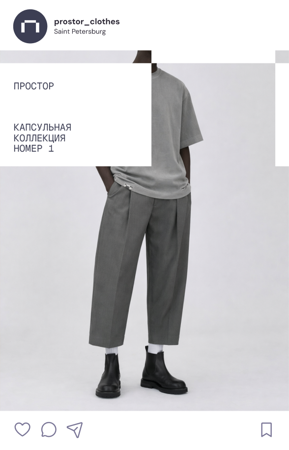
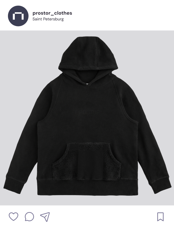
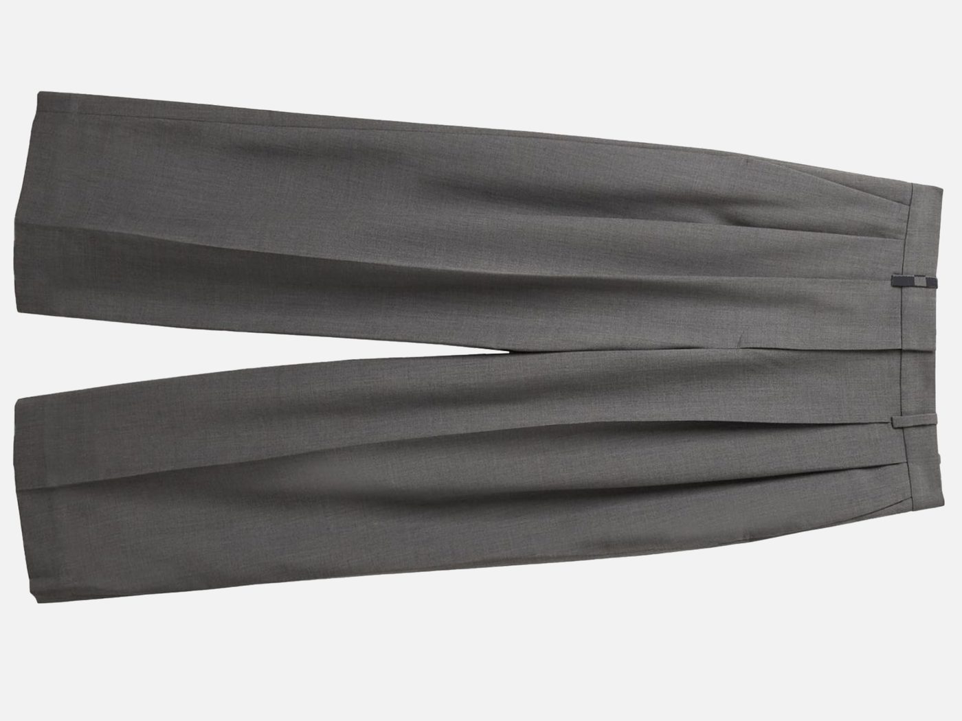
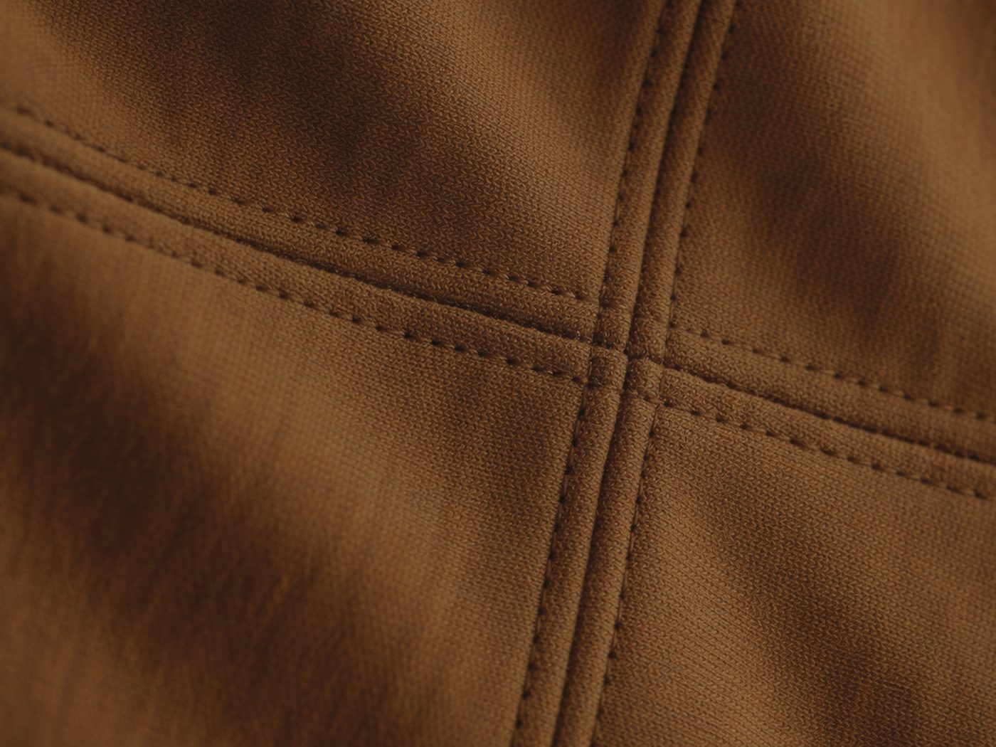
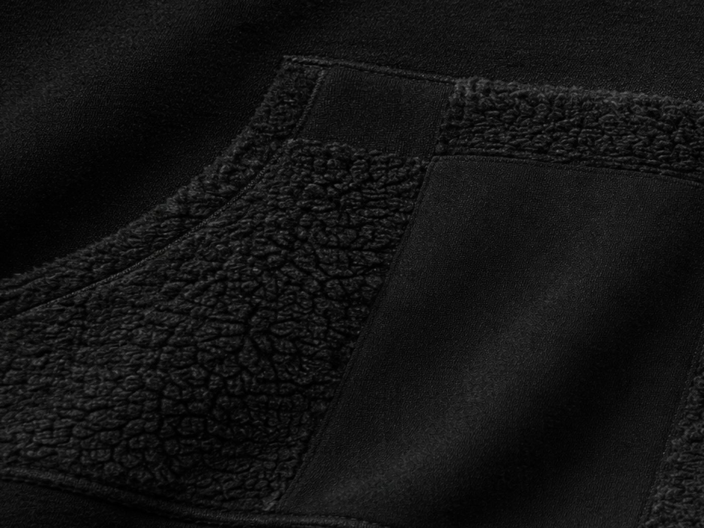
The brief: build a recognizable, original identity that grows directly out of the project's own logic—and a commercial, functional photography style based on references the client supplied, convincing enough on its own to help bring investment into the project.
The audience is people who love roomy, comfortable clothing—culturally active, mostly based in Saint Petersburg and Moscow, middle and upper-middle class. Style matters to them, and they're won over by attention to detail, good materials, and function.
Archetype: the Creator. Tone of voice: calm, intelligent, with a sense of freedom and space.
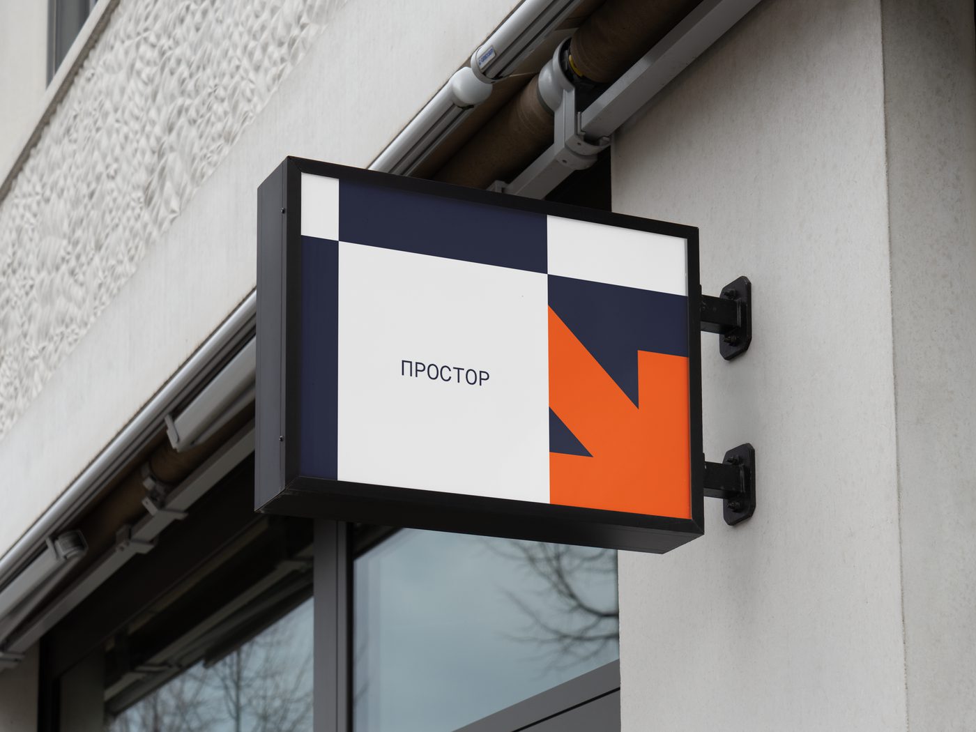
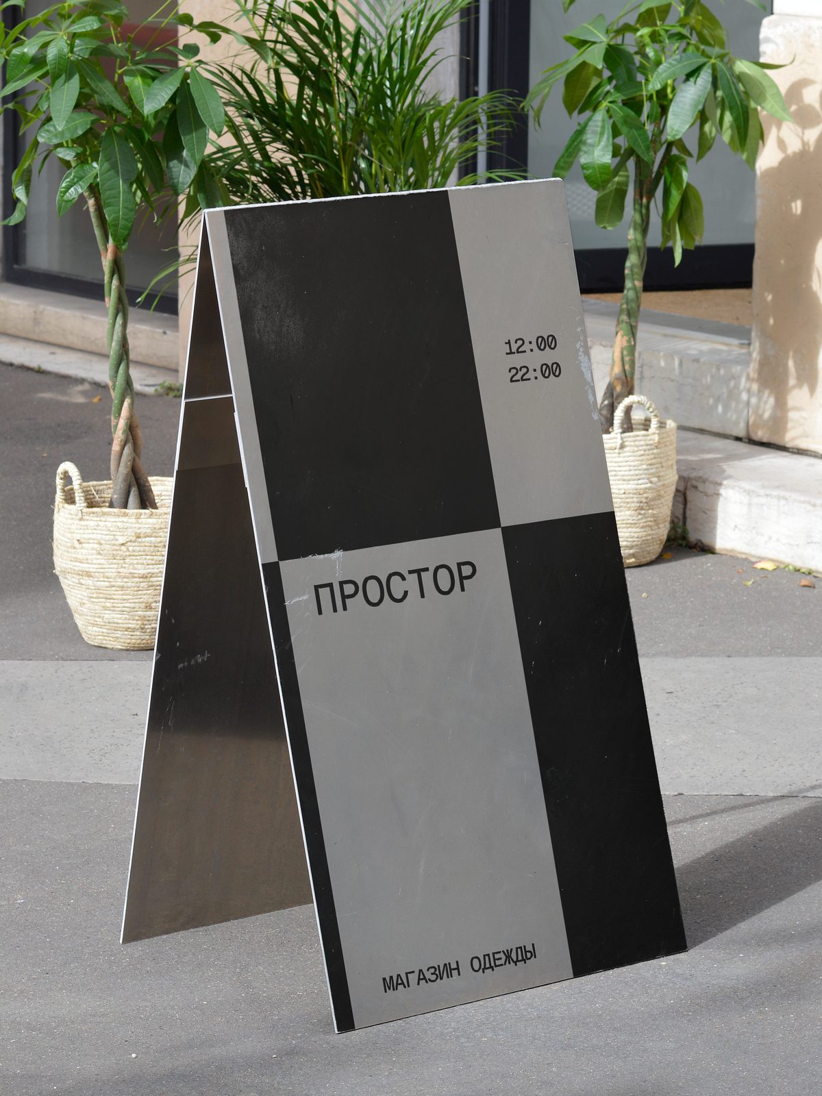
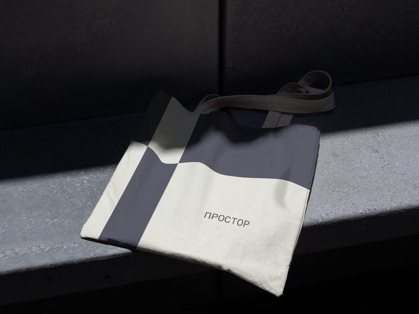
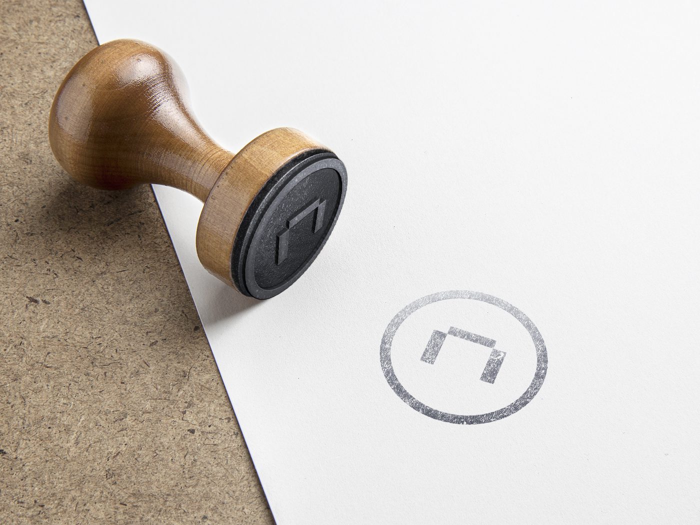
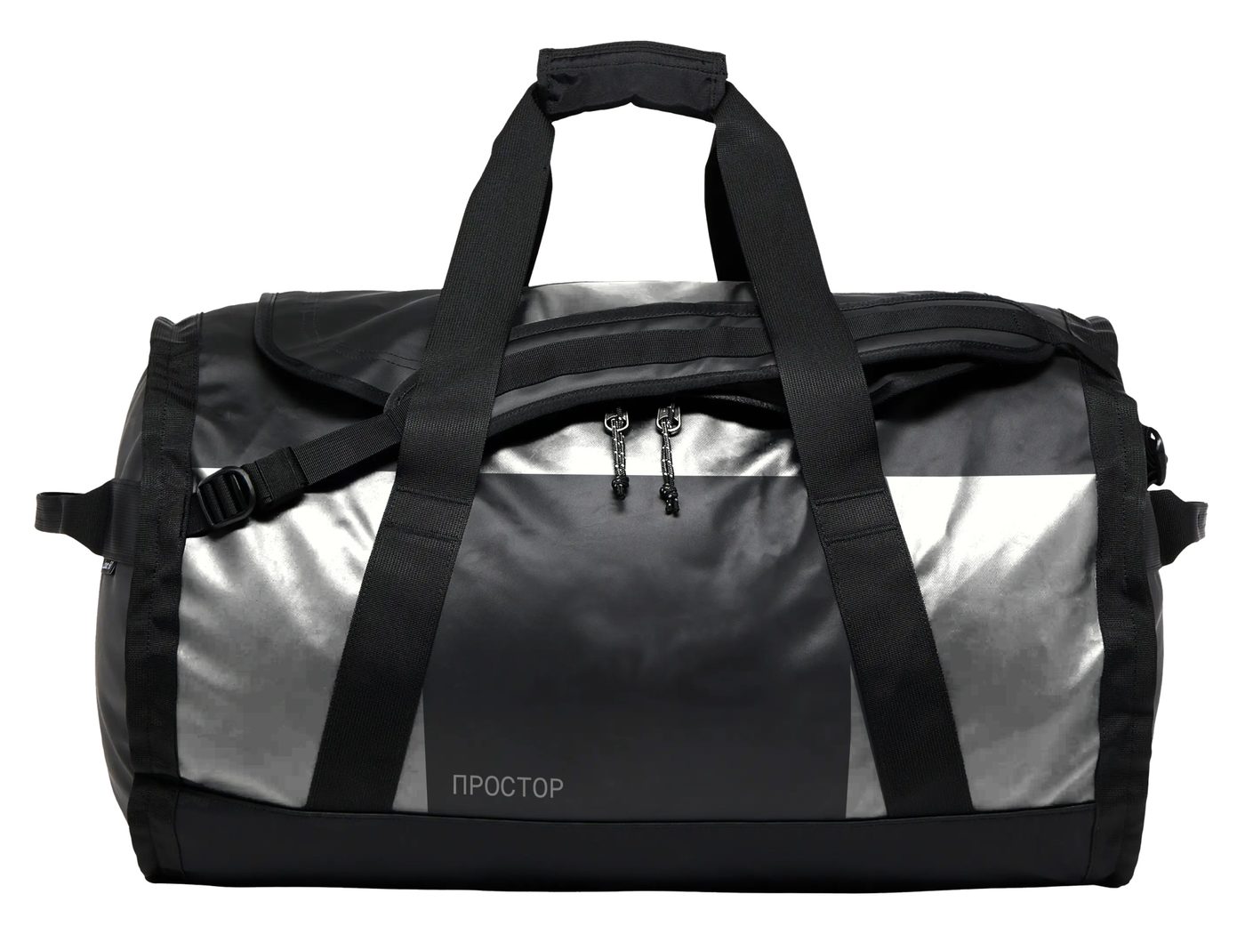
At the center of the identity is the Cyrillic letter П—the initial of простор—rebuilt as an adaptive, grid-based mark. Rather than a fixed logotype, it's assembled from independent blocks that can shift, recombine, and even leave a gap in the letterform itself: the same openness the clothing is built around, translated into a sign. The same blocks stretch to fit a round sticker, a wide sign, or a narrow card—the grid adapts to the format, instead of the format being forced to fit a fixed logo.
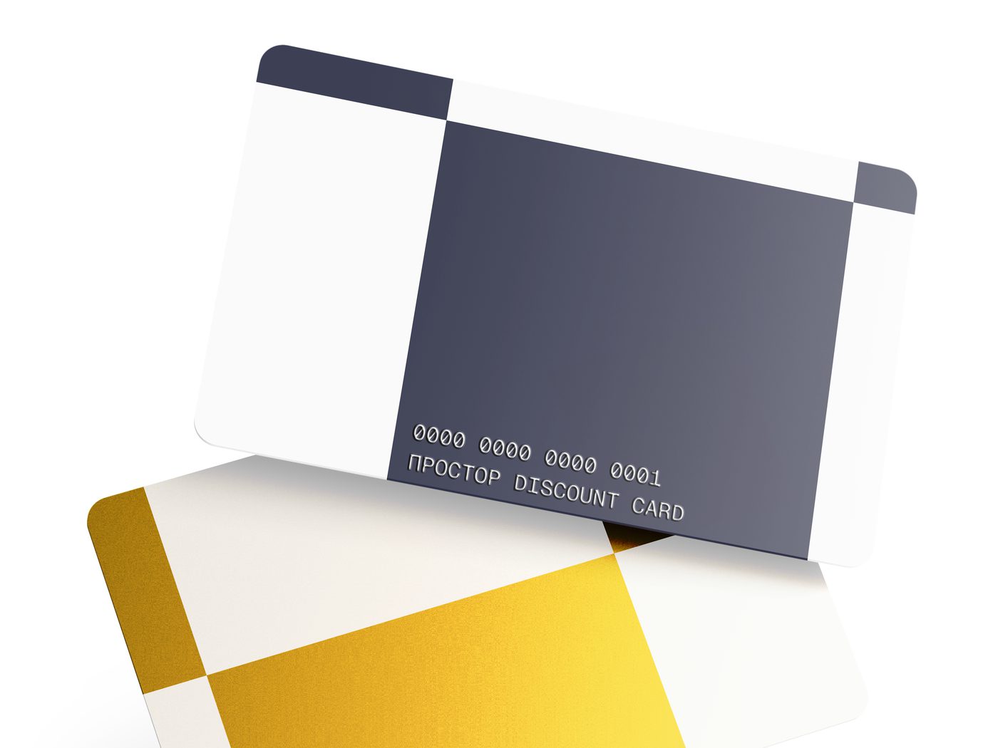
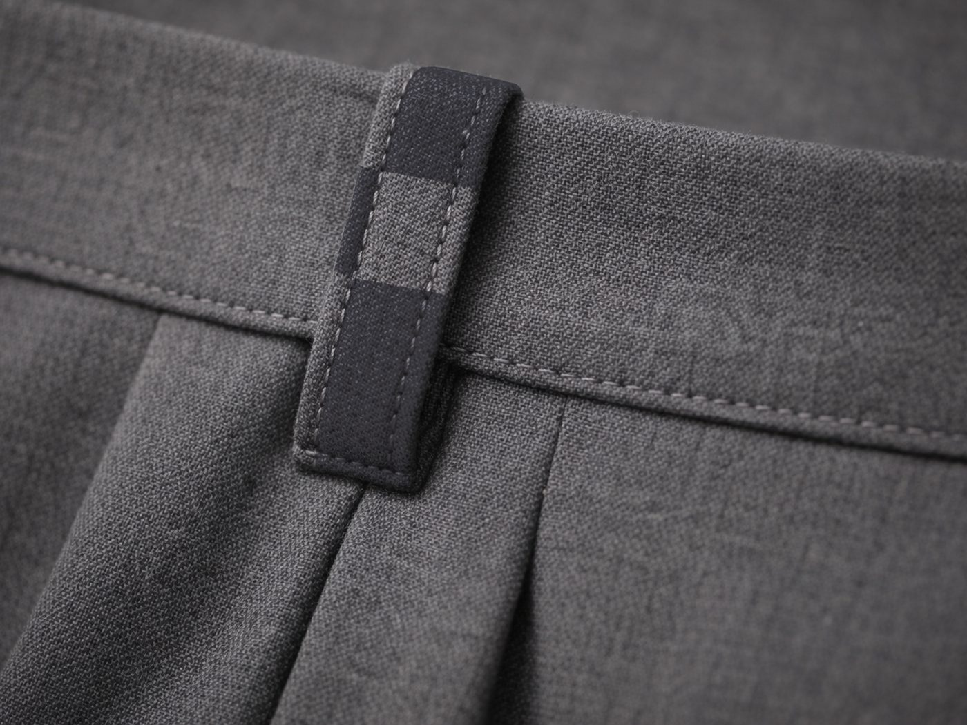
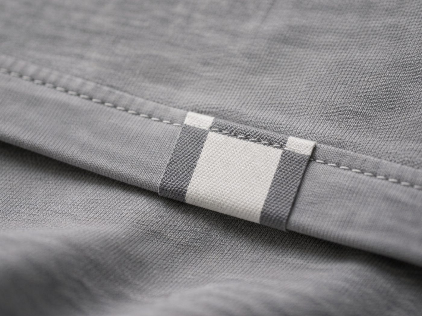
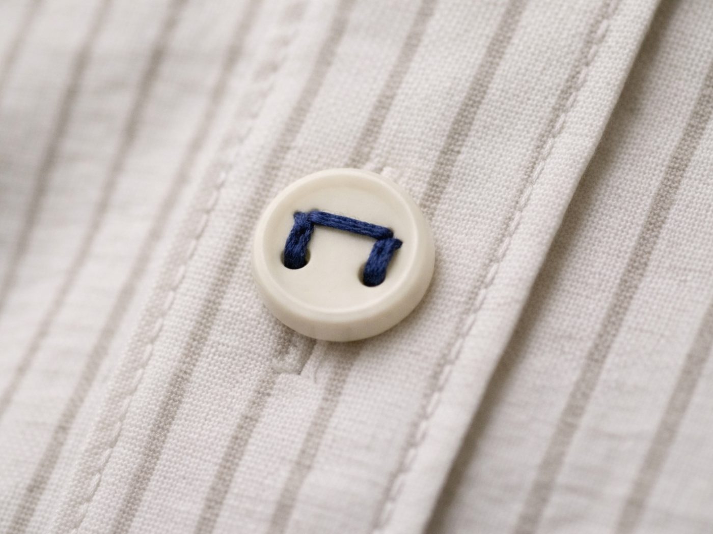
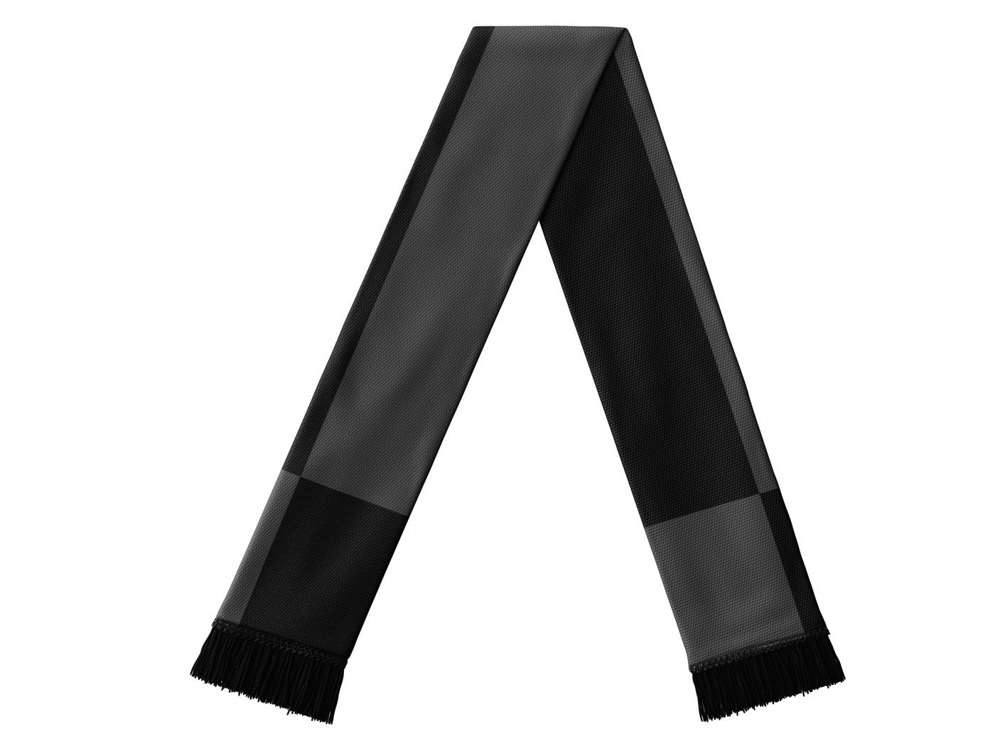
That grid logic carries through everything the brand touches—a checkerboard motif that recolors itself by application: navy and orange for signage, gold for a premium loyalty tier, plain ink for a stamped mark. Same structure, different register each time it's used.